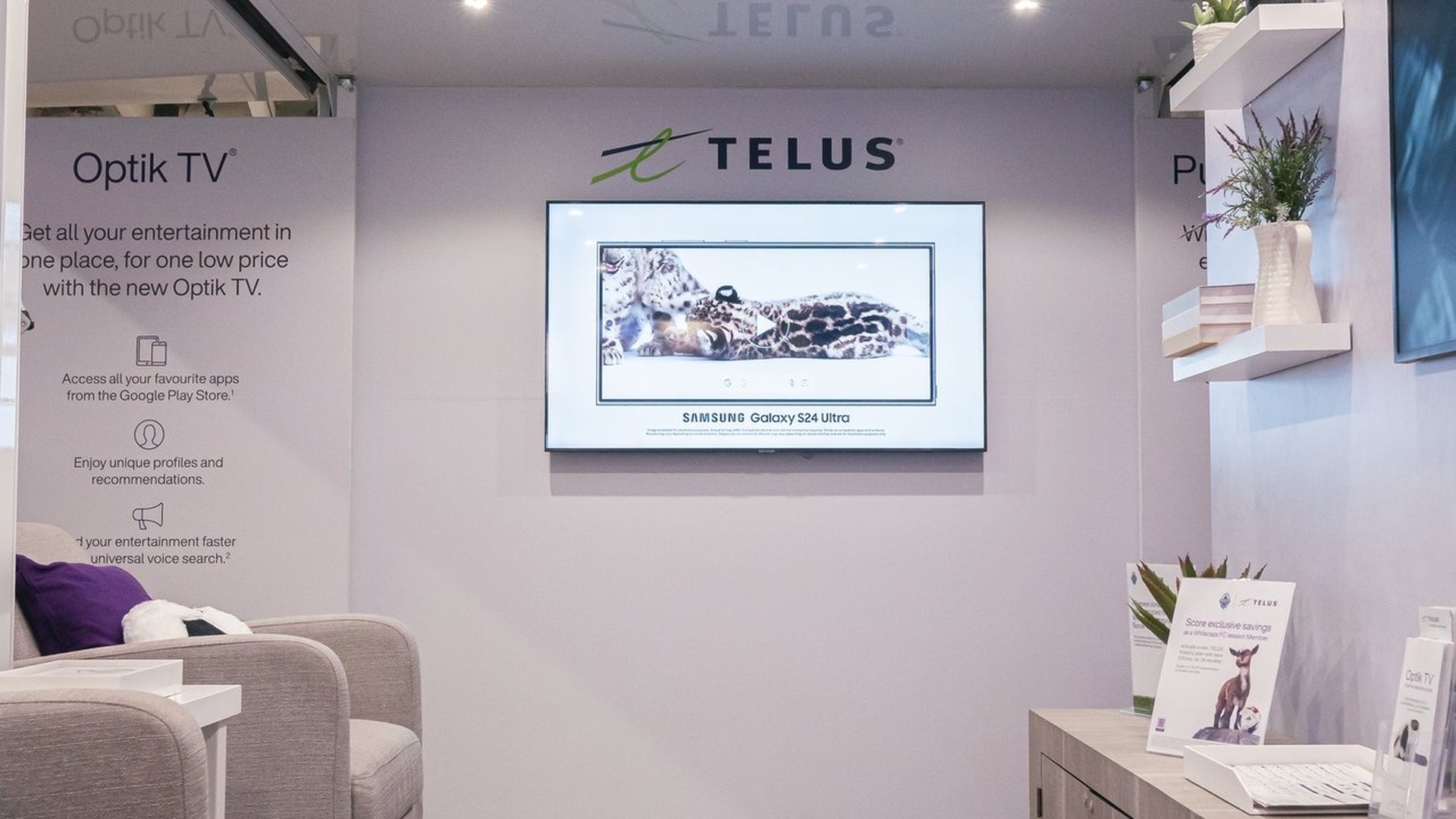
Every activation has a floor plan. Not every floor plan has a strategy. The gap between the two is spatial design.
The difference between an activation where visitors wander for 3 minutes and leave confused, and one where they spend 12 minutes and convert, is spatial design. Not bigger screens. Not more staff. The physical arrangement of the space itself.
Experience architecture is the discipline of designing environments that guide human behavior toward specific outcomes. In mobile marketing tours, where every square foot is expensive and the visitor’s time is voluntary, it is the highest-leverage investment you can make.
Space Is Not Neutral
Environmental psychology has demonstrated for decades that physical spaces shape behavior predictably. Retail designers know this. Museum curators know this. Casino architects certainly know this. The same principles apply to experiential marketing, but with tighter constraints. A mobile tour environment is typically 100 to 600 square feet. You do not have the luxury of sprawl. Every design decision either earns time or loses it.
The research is specific1. Counterclockwise circulation increases dwell time by 23%. A magnetic focal point visible from 50+ feet increases approach rate by 40%. A decompression zone at entry increases engagement by 18%. Clear sight lines increase exploration by 31%. Social proof positioning increases conversion by 27%. These are not opinions. They are measured effects from environmental psychology and retail design research, applied to experiential spaces.
Zone Allocation: The 15 / 50 / 35 Rule
High-performing activations divide their footprint into three zones with consistent proportional allocation1.
Welcome Zone (15%)
The first 15% of your space is transition territory. The visitor has just stepped from the street or parking lot into your environment. Their brain needs 3 to 5 seconds to adjust, orient, and decide whether to proceed. The Welcome Zone should do three things: confirm the visitor made a good choice (immediate visual reward), orient them to the space (what is where), and slow their pace (from walking speed to browsing speed).
Do not put your lead capture form here. Do not station a greeter who immediately asks qualifying questions. The visitor has not earned enough value yet to justify giving you anything.
Core Zone (50%)
Half your space belongs to the primary experience. This is where product interaction, demonstration, storytelling, and sensory engagement happen. It is where dwell time accumulates and where the brand relationship forms.
The Core Zone should contain your strongest engagement elements: product demos, interactive displays, hands-on stations, and the moments that create emotional memory. The design principle is simple: make it impossible to see everything from one spot. Progressive revelation, where each step forward reveals something new, keeps visitors moving deeper.
This zone needs enough space for visitors to linger without blocking each other. Crowding in the Core Zone is the fastest way to compress dwell time. At 60 to 70% occupancy1, visitors engage freely. Above that, they start looking for the exit.
Support Zone (35%)
The final 35% handles everything that converts engagement into outcomes: lead capture stations, product purchase or sampling, social sharing moments, one-on-one consultations, and the exit experience. This zone gets more space than most teams allocate because conversion takes time. A visitor who spends 10 minutes in the Core Zone but hits a bottleneck at lead capture will abandon the process. Give them room, give them privacy for conversations, and give them a reason to share.
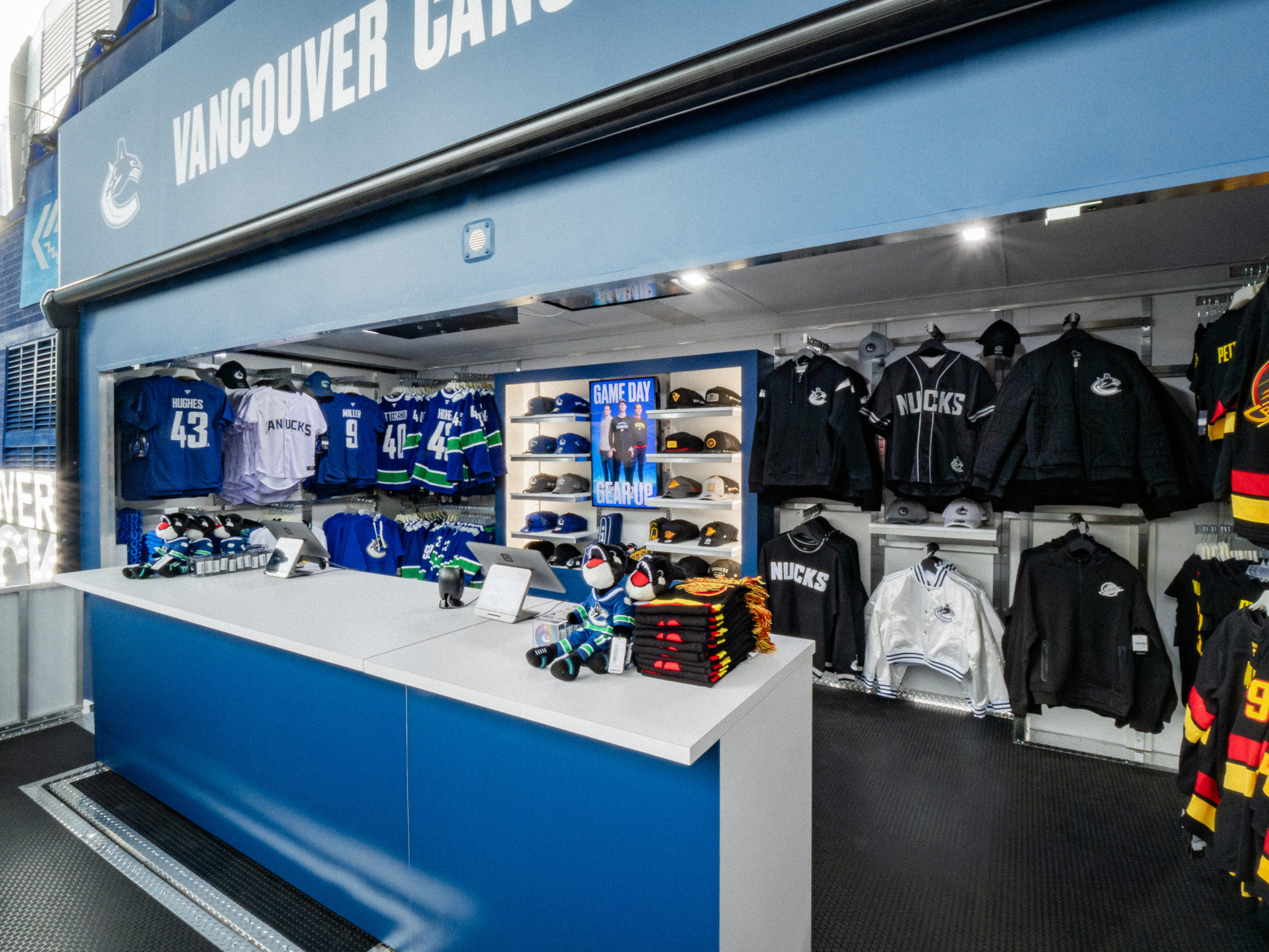
Six Spatial Principles That Move People
Counterclockwise Flow
When people enter a new space, they naturally tend to turn right. Designing a counterclockwise circuit (entry on the right, flow to the left, exit on the left or back at the entry) aligns with this instinct and produces a longer, more comfortable path. Counterclockwise layouts increase dwell time by 23% compared to clockwise or unstructured alternatives. This finding is consistent across retail, museum, and experiential research2.
In a trailer or container activation, this means placing the entry door on the right side (relative to the visitor’s approach), with the experience flowing left through the space.
Magnetic Focal Point
A single, prominent visual element visible from 50+ feet outside the activation increases approach rate by 40%1. This is your exterior draw: a hero product display, a dramatic light installation, a large-format video screen, or an architectural element that reads from distance. The focal point answers the only question a passerby is asking: “What is that, and is it worth my time?”
Decompression Zone
Borrowed directly from retail design (Paco Underhill’s work at Envirosell), the decompression zone is a brief transition area at entry where visitors adjust to the new environment. An intentional decompression zone increases engagement by 18%1. In practice, this is 3 to 5 feet of open space just inside the entrance. No product. No staff interception. No signage to read. Just a visual landing that lets the visitor orient themselves before the experience begins.
Sight Lines
Clear sight lines from any point in the space to the next engagement zone increase exploration by 31%1. When visitors can see what comes next without feeling lost, they move forward. When they cannot see around a corner or over a partition, they retreat. This does not mean the space should be wide open. It means every position should offer a clear view of the next thing worth seeing.
Social Proof Positioning
Placing social content, testimonial displays, or user-generated content feeds in the Support Zone increases conversion by 27%1. The mechanism is straightforward: visitors who see others sharing their experience have lower resistance to doing the same. Position social proof after the core experience, not before it. Before the experience, social content is marketing. After the experience, it is validation.
Progressive Revelation in Spatial Design
Do not show everything from the entrance. Each step deeper into the space should reveal something new: a product, a texture, a view, a sound. This is the same principle that makes good architecture and good storytelling work. The promise of “more” keeps people moving.
Applying This in 200 Square Feet
A 200-square-foot trailer is not a limitation. It is a discipline.
- Welcome Zone (30 sq ft): A clean entry with brand signage and a single visual anchor. No clutter. Staff positioned to the side, not blocking.
- Core Zone (100 sq ft): Two or three product interaction points arranged along a counterclockwise path. Partitions at 4-foot height maintain sight lines while creating progressive revelation.
- Support Zone (70 sq ft): Lead capture on a tablet. A social sharing station with branded backdrop. A brief one-on-one consultation area. The exit routes back past the Welcome Zone, completing the circuit.
This layout, in 200 square feet, incorporates every principle above. It is not about size. It is about intention.
The Mistake Most Builders Make
The most common spatial design failure is treating the activation like a retail display: products on walls, open center, staff standing around waiting. This layout produces exactly the behavior it is designed for. Visitors enter, scan the perimeter from the doorway, and leave in 90 seconds.
Experience architecture is not decoration. It is behavioral infrastructure. Every wall angle, sight line, material transition, and staff position either extends or compresses the time a visitor spends with your brand. As covered in our dwell time analysis, minutes are the metric that predicts pipeline. Spatial design is what earns those minutes.
Design the space for the behavior you want, not the inventory you need to display.
Sources
- Sequoia spatial design framework and Five Principles of Activation Design, The Complete Guide to Mobile Marketing Tours, 2026.
- Environmental psychology and retail design research, notably Paco Underhill, Why We Buy: The Science of Shopping (Envirosell).
Want the full spatial-design framework, zone-by-zone floor plans, and case studies from real Sequoia builds? Download The Complete Guide to Mobile Marketing Tours for 62 pages of frameworks, benchmarks, and worked examples.